Written by
Sean Wallace

For this branding project, the vision we wanted to communicate was a world where anyone with an eye for letters can shape the typefaces we all read every day.
Section
Complex craft, other tools fall short
Type design isn’t easy. The detail to adjust the curvature of a letter, make a cohesive pairing between an “A” and “W” takes the attention of a modern craftsperson. But for the people that notice typography on a street sign, the local restaurant’s menu, or their favorite app, the reward of shaping how we see the world around us is a rewarding expertise.
FontForge is a brand created by the community. It is a free, open-source tool that is built to tackle all the nuances of designing a typeface. Of the few options available, most design tools available require an expensive subscription or aren’t specifically designed for typography. FontForge keeps type design open, teachable, and in the hands of the people who care about it most.
For this branding project, the vision we wanted to communicate was a world where anyone with an eye for letters can shape the typefaces we all read every day.
The result is a brand that carries the fluency of the craft – free to use, serious to master.
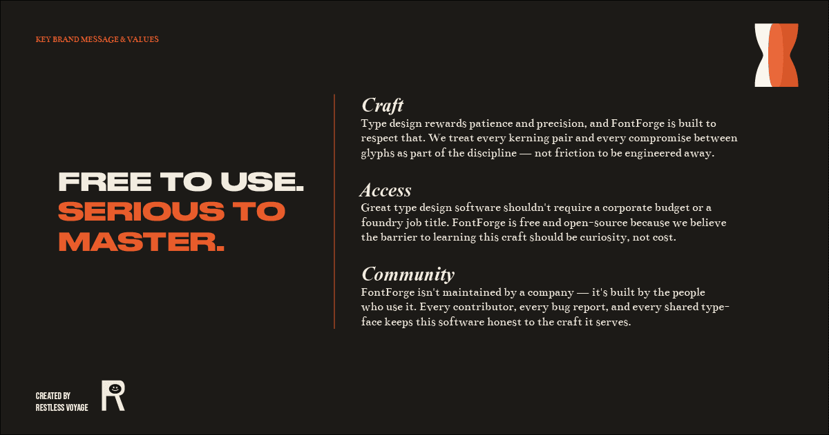
Imaginative brand that is fluent and unpretentious
FontForge needed a brand that’s honest about the difficulty, and made by people who actually care about letters.
FontForge removes the financial barrier to entry without pretending type design itself is easy. It respects the audience's intelligence and ambition rather than selling them a shortcut.
FontForge is the last typography you’ll ever use because you’ve been through the struggle of hoping other tools work that weren’t meant for the job.
The FontForge brand speaks like a knowledgeable friend who happens to know everything about type — never like a corporation selling software. It has the confidence of an expert and the warmth of someone who genuinely wants you to get good at this.
Brand visuals inspired by the craft
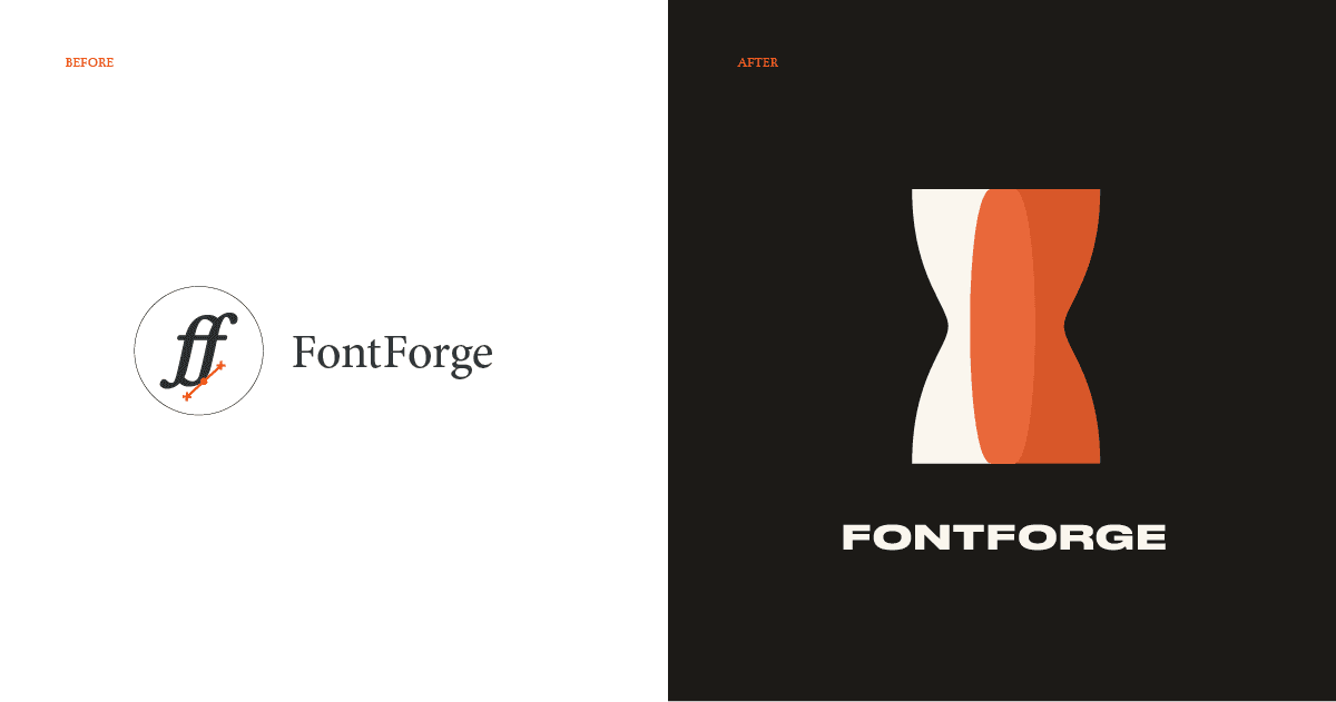
The visual identity leads with bold, expressive typography as the primary design element — confident and graphic, but discovered rather than marketed.
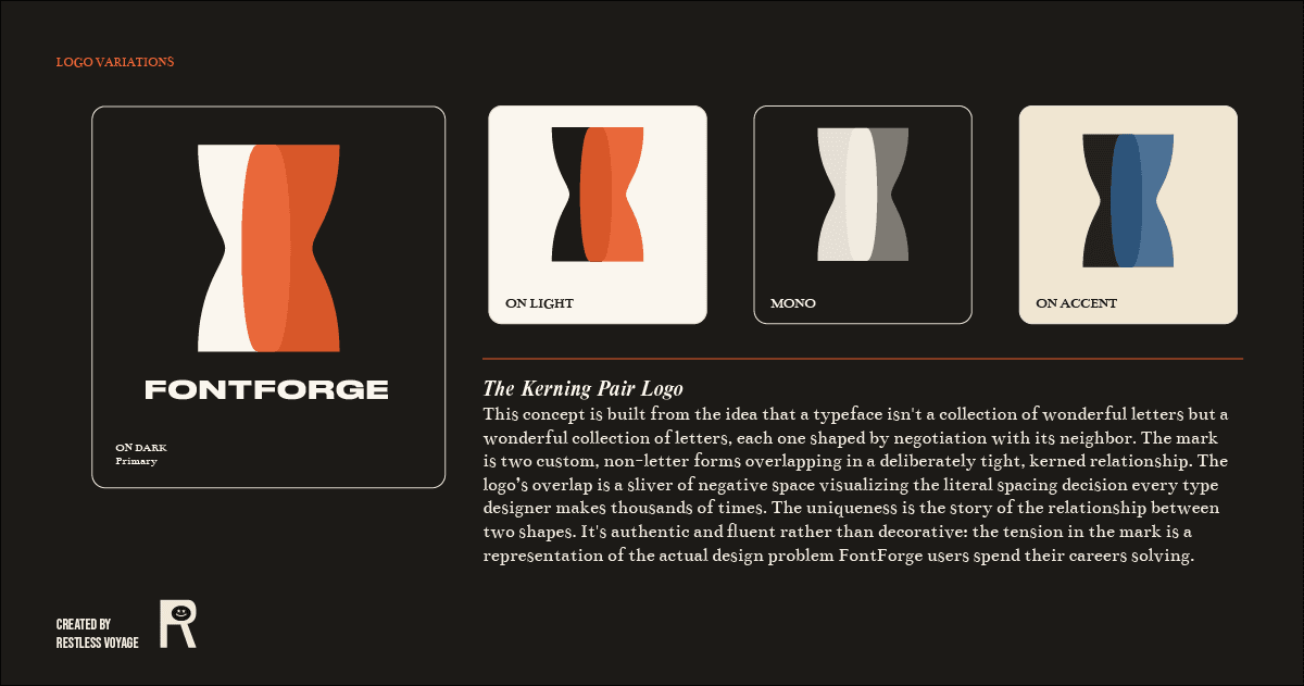
The logo concept is built around a simple idea that every type designer faces. The Kerning Pair logo is built from the idea that a typeface isn't a collection of wonderful letters but a wonderful collection of letters, each one shaped by negotiation with its neighbor.
The mark is two custom, non-letter forms overlapping in a deliberately tight, kerned relationship. The logo’s overlap is a sliver of negative space visualizing the literal spacing decision every type designer makes thousands of times.
The uniqueness is the story of the relationship between two shapes. It's authentic rather than decorative: the tension in the mark is a representation of the actual design problem FontForge users spend their careers solving.
Druk Wide font provides the wide, graphic confidence up top with a slightly unruly italic underneath in Reckless Neue. Type styles that match the bold and graphic brand, but never corporate. Bentham grounds the system in a body serif with genuine print pedigree, reinforcing the brand's core idea that everyday reading deserves the same attention FontForge gives to designing it.
Ink Black and Proof Paper root the color palette in the physical world of printing and proofing, which fits a brand built by people who notice type in the real world. Proofer's Red and Blueprint Blue give the system a bold, graphic energy while nodding to the editor's-pencil and drafting-table references embedded in the craft.
Free to use, serious to master
Type design is one of the most technically demanding creative disciplines there is — every glyph has to work in harmony with every other glyph.
The forms themselves are hardly new, just newly considered.
FontForge was built by people who understood that complexity from the start. It's the only open-source software made exclusively for type design, free to use and free to study, maintained by contributors instead of a corporation.
"We built the software we wished existed when we were learning — free, honest about the difficulty, and made by people who actually care about letters."
https://fontforge.org/