Written by
Sean Wallace

For this branding project, the vision we wanted to communicate was more appreciation for a world where objects are kept for their stories. Crafted from trees that lived before you did.
Section
Turning a gift into an object of genuine personal meaning
Today’s world is about speed, uniformity, and disposability. But still all of us have that inkling inside that objects which carry emotional weight and last a lifetime are a little more valuable.
Wallace Woodworking is a brand built from handmade quality and sentimental permanence. Most wooden goods on shelves today are factory-cut from fastfarmed foreign wood, sanded smooth of any character, and priced for volume.
For this branding project, the vision we wanted to communicate was more appreciation for a world where objects are kept for their stories. Crafted from trees that lived before you did.
The result is a brand that carries the weight of objects generations in the making. Grain history, local origin, the maker’s hand - all found their place in rebellious yet classic identity.
Preservation of something that was already meaningful
Wallace Woodworking wanted to create a brand that stood for the opposite. Transform locally sourced wood into lasting meaning. Every piece is made by hand, from wood with a history, for people who understand that real value is measured in decades.
Hand-shaped bowls, cutting boards, and eccentric wooden objects crafted from locally-salvaged and recycled old-growth hardwood, often sourced directly from the customer's own property. One-of-a-kind objects with traceable wood origins, distinctive natural grain, and craftsmanship quality that improves with age rather than degrading.
The brand work needed to emphasize the belief that the most meaningful things in life are made slowly, from materials that took decades - even centuries to become what they are.
The brand strategy and identity is built around a simple idea we developed from this context:
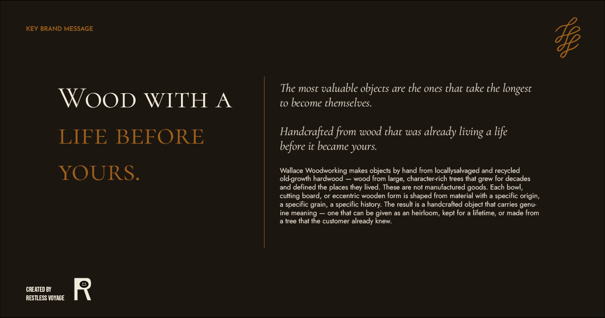
Crafted from trees that lived before you did. Wood with a life before yours.
A brand with the same care, precision, and honesty of the wood objects
The logo design is a mark similar to one you receive on the bottom of one of these hand-crafted objects. We wanted to emphasize the crafted appearance, energetic curves made by a real person. Structurally and visually unique compared to the templated, squared-off brands in the home goods industry.
The logo leans into the eccentric, the irregular, the unexpected shapes that wood produces when it is allowed to be itself rather than engineered into uniformity.
The brand personality focuses on rootedness and permanence. Each piece is made from wood of a specific place, with a specific history. The brand doesn’t treat wood as a raw material, the wood is the story.
The tone and personality in the branding is somewhat serious, mature and classic - yet lateral and unexpected. And how the brand speaks is like the way a skilled craftsman thinks: deliberate, specific, and unhurried. No urgency tactics, no hollow superlatives, no language that could belong to any other brand.
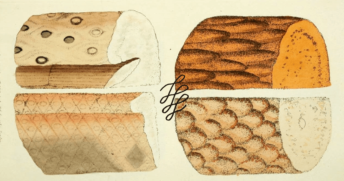
The visual world, palette and typography, matches that steadfastness with the distinct feeling like the interior of a craftsman's workshop at golden hour — warm, specific, and unpretentious. Brand colors pull from actual wood tones — walnut brown, ash cream, ebony near-black, live-edge ochre.
"The tree that shaded your grandmother's yard, the oak that came down in last year's storm, the walnut that defined a neighborhood corner — these aren't waste. Wallace Woodworking is the only studio that turns wood from lives already lived into objects built to begin new ones."
Culture can catch up. There’s still time. Thank you to craftsman and father, Larry Wallace for letting me work on such a personal, meaningful brand.